This chapter analyses a core set of indicators on health and health systems. Country dashboards and OECD snapshots shed light on how countries compare across five dimensions: health status, risk factors for health, access, quality, and health system capacity and resources. Quadrant charts illustrate how much health spending is associated with health outcomes, access and quality of care.
Health at a Glance 2023

1. Indicator overview: Country dashboards and major trends
Abstract
Introduction
Health indicators offer an “at a glance” perspective on how healthy populations are, and how well health systems perform. This introductory chapter provides a comparative overview of OECD countries across 20 core indicators, organised around five dimensions of health and health systems (Table 1.1). Indicators are selected based on how relevant and actionable they are from a policy perspective; as well as the more practical consideration of data availability across countries. The extent to which health spending is associated with health outcomes, access and quality of care is also explored.
Such analysis does not indicate which countries have the best-performing health systems, particularly as only a small subset of the many indicators in Health at a Glance are included here. Rather, this chapter identifies some relative strengths and weaknesses. This can help policy makers determine priority action areas for their country, with subsequent chapters in Health at a Glance providing a more detailed suite of indicators, organised by topic area.
Table 1.1. Population health and health system performance: Core indicators
|
Dimension |
Indicator |
|---|---|
|
Health status (Chapter 3) |
Life expectancy – years of life at birth Avoidable mortality – preventable and treatable deaths (per 100 000 people, age‑standardised) Chronic conditions – diabetes prevalence (% adults, age‑standardised) Self-rated health – population in poor health (% population aged 15+) |
|
Risk factors for health (Chapter 4) |
Smoking – daily smokers (% population aged 15+) Alcohol – litres consumed per capita (population aged 15+), based on sales data Obesity – population with body mass index (BMI) ≥30 (% population aged 15+) Ambient air pollution – deaths due to ambient particulate matter, especially PM2.5 (per 100 000 people) |
|
Access to care (Chapter 5) |
Population coverage, eligibility – population covered for core set of services (% population) Population coverage, satisfaction – population satisfied with availability of quality healthcare (% population) Financial protection – expenditure covered by compulsory prepayment schemes (% total expenditure) Service coverage – population reporting unmet needs for medical care (% population) |
|
Quality of care (Chapter 6) |
Safe primary care – antibiotics prescribed (defined daily dose per 1 000 people) Effective primary care – avoidable hospital admissions (per 100 000 people, age‑ and sex-standardised) Effective preventive care – mammography screening within the past two years (% of women aged 50‑69) Effective secondary care – 30‑day mortality following acute myocardial infarction and ischaemic stroke (per 100 admissions for people aged 45 and over, age‑ and sex-standardised) |
|
Health system capacity and resources (Chapters 5, 7 and 8) |
Health spending – total health spending (per capita, USD using purchasing power parities) Health spending – total health spending (% GDP) Doctors – number of practising physicians (per 1 000 people) Nurses – number of practising nurses (per 1 000 people) Hospital beds – number of hospital beds (per 1 000 people) |
Note: Avoidable hospital admissions cover asthma, chronic obstructive pulmonary disease, congestive heart failure and diabetes.
Based on these indicators, country dashboards are produced. These compare a country’s performance to that of other countries and to the OECD average. Comparisons are made based on the latest year available. For most indicators this refers to 2021, or to the nearest year if 2021 data are not available for a given country.
Country classification for each indicator is into one of three colour-coded groups:
blue when the country’s performance is close to the OECD average
green when the country’s performance is considerably better than the OECD average
red when the country’s performance is considerably worse than the OECD average.
The exception to this grouping is the dashboard on health system capacity and resources, where indicators cannot be easily classified as showing better or worse performance. Here, lighter and darker shades of blue signal whether a country has considerably less or more of a given healthcare resource than the OECD average.
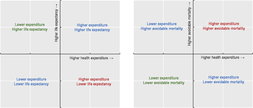
Accompanying these country dashboards are OECD snapshots and quadrant charts. OECD snapshots provide summary statistics for each indicator. Quadrant charts illustrate simple associations (not causal relationships) between how much countries spend on health and how effectively health systems function. Figure 1.1 shows the interpretation of each quadrant, taking health outcome variables as an example. Further information on the methodology, interpretation and use of these country dashboards, OECD snapshots and quadrant charts is provided in the boxed text below.
Figure 1.1. Interpretation of quadrant charts: Health expenditure and health outcome variables
Methodology, interpretation and use
Country dashboards
The classification of countries as being close to, better or worse than the OECD average is based on an indicator’s standard deviation (a common statistical measure of dispersion). Countries are classified as “close to the OECD average” (blue) whenever the value for an indicator is within one standard deviation from the OECD average for the latest year. Particularly large outliers (larger than three standard deviations) are excluded from calculations of the standard deviation to avoid statistical distortions.
For a typical indicator, about 65% of countries will be close to the OECD average, with the remaining 35% performing significantly better (green) or worse (red). When the number of countries that are close to the OECD average is higher (lower), it means that cross-country variation is relatively low (high) for that indicator. Changes over time are also indicated in the dashboard.
OECD snapshots
For each indicator, the OECD average, highest and lowest values are shown, as are the three countries with the largest improvements over time in terms of changes to absolute values.
Quadrant charts
Quadrant charts plot health expenditure per capita against another indicator of interest (on health outcomes, access and quality of care). They show the percentage difference of each indicator compared to the OECD average. The centre of each quadrant chart is the OECD average. Data from the latest available year are used. A limitation is that lagged effects are not taken into account – for example, it may take some years before higher health spending translates into longer life expectancy.
Health status
Four health status indicators reflect core aspects of both the quality and quantity of life. Life expectancy is a key indicator for the overall health of a population; avoidable mortality focuses on premature deaths that could have been prevented or treated. Diabetes prevalence shows morbidity for a major chronic condition; self-rated health offers a more holistic measure of mental and physical health. Figure 1.2 presents a snapshot of health status across OECD countries, and Table 1.2 provides more detailed country comparisons.
Figure 1.2. Health status across the OECD, 2021 (or nearest year)
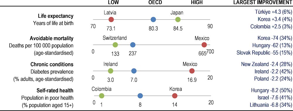
Note: Largest improvement shows countries with largest changes in absolute value over ten years (% change in brackets).
Source: OECD Health Statistics 2023; IDF Diabetes Atlas 2021.
Japan, Switzerland and Korea lead a large group of 27 OECD countries in which life expectancy at birth exceeded 80 years in 2021. A second group, including the United States, had life expectancy between 75 and 80 years. Latvia, Lithuania, Hungary and the Slovak Republic had the lowest life expectancy, at less than 75 years. While life expectancy has increased in most countries over the past decade, many of these gains were wiped out during the pandemic.
Avoidable mortality rates (from preventable and treatable causes) were lowest in Switzerland and Japan, where fewer than 135 per 100 000 people died prematurely. Avoidable mortality rates were also relatively low (under 150 per 100 000 people) in Israel, Korea, Iceland, Australia, Italy and Luxembourg. Mexico, Latvia, Lithuania and Hungary had the highest avoidable mortality rates, at over 400 premature deaths per 100 000 people.
Diabetes prevalence in 2021 was highest in Mexico, Türkiye, Chile and the United States, with over 10% of adults living with diabetes (data age‑standardised to the world population). Prevalence rates have been broadly stable over time in many OECD countries, especially in western Europe, but they increased markedly in Türkiye and Iceland. Such upward trends are due in part to rising rates of obesity and physical inactivity.
Almost 8% of adults considered themselves to be in poor health in 2021, on average across OECD countries. This ranged from over 13% in Korea, Japan, Portugal, the Slovak Republic, Latvia and Lithuania to under 3% in Colombia, New Zealand and Canada. However, socio-cultural differences, the share of older people and differences in survey design affect cross-country comparability. People with lower incomes are generally less positive about their health than people on higher incomes in all OECD countries.
Investing more in health systems contributes to gains in health outcomes by offering more accessible and higher-quality care. Differences in risk factors such as smoking, alcohol and obesity also explain cross-country variation in health outcomes. Social determinants of health matter too – notably income levels, better education and improved living environments.
Table 1.2. Dashboard on health status, 2021 (unless indicated)
|
Life expectancy |
Avoidable mortality |
Chronic conditions |
Self-rated health |
|||||
|---|---|---|---|---|---|---|---|---|
|
Years of life at birth |
Deaths per 100 000 population (age-standardised) |
Diabetes prevalence (% adults, age-standardised) |
Population in poor health (% population aged 15+) |
|||||
|
OECD |
80.3 |
+ |
237 |
+ |
7.0 |
- |
7.9 |
+ |
|
Australia |
83.3 |
+ |
144 |
+ |
6.4 |
+ |
3.7³ |
+ |
|
Austria |
81.3 |
+ |
198 |
+ |
4.6 |
+ |
7.4 |
+ |
|
Belgium |
81.9 |
+ |
178² |
+ |
3.6 |
+ |
8.0 |
+ |
|
Canada |
81.6 |
+ |
171² |
+ |
7.7 |
+ |
2.8 |
= |
|
Chile |
81.0 |
+ |
247¹ |
- |
10.8 |
- |
6.8 |
- |
|
Colombia |
76.8 |
+ |
328¹ |
- |
8.3 |
+ |
1.3² |
N/A |
|
Costa Rica |
80.8 |
+ |
237¹ |
- |
8.8 |
+ |
3.4² |
N/A |
|
Czech Republic |
77.2 |
- |
335 |
- |
7.1 |
- |
8.6 |
+ |
|
Denmark |
81.5 |
+ |
174¹ |
+ |
5.3 |
+ |
7.7 |
+ |
|
Estonia |
77.2 |
+ |
363 |
+ |
6.5 |
+ |
12.1 |
+ |
|
Finland |
81.9 |
+ |
186¹ |
+ |
6.1 |
- |
6.2 |
+ |
|
France |
82.4 |
+ |
160³ |
+ |
5.3 |
+ |
8.9 |
- |
|
Germany |
80.8 |
+ |
195¹ |
+ |
6.9 |
- |
12.4 |
- |
|
Greece |
80.2 |
- |
204¹ |
- |
6.4 |
- |
6.5 |
+ |
|
Hungary |
74.3 |
- |
404² |
+ |
7.0 |
- |
8.2 |
+ |
|
Iceland |
83.2 |
+ |
142 |
+ |
5.5 |
- |
5.9² |
+ |
|
Ireland |
82.4 |
+ |
172² |
+ |
3.0 |
+ |
5.2 |
- |
|
Israel |
82.6 |
+ |
141¹ |
+ |
8.5 |
- |
10.9 |
+ |
|
Italy |
82.7 |
+ |
146³ |
+ |
6.4 |
- |
8.1 |
+ |
|
Japan |
84.5 |
+ |
134¹ |
+ |
6.6 |
+ |
13.6² |
+ |
|
Korea |
83.6 |
+ |
142¹ |
+ |
6.8 |
+ |
13.8¹ |
+ |
|
Latvia |
73.1 |
= |
531 |
- |
5.9 |
+ |
13.1 |
+ |
|
Lithuania |
74.2 |
+ |
481 |
+ |
5.8 |
+ |
13.1 |
+ |
|
Luxembourg |
82.7 |
+ |
147 |
+ |
5.9 |
- |
5.9 |
+ |
|
Mexico |
75.4 |
+ |
665¹ |
- |
16.9 |
- |
N/A |
N/A |
|
Netherlands |
81.4 |
+ |
161¹ |
+ |
4.5 |
+ |
5.2 |
+ |
|
New Zealand |
82.3 |
+ |
179³ |
+ |
6.2 |
+ |
2.1 |
+ |
|
Norway |
83.2 |
+ |
156³ |
+ |
3.6 |
+ |
9.0¹ |
- |
|
Poland |
75.5 |
- |
344¹ |
- |
6.8 |
+ |
10.3 |
+ |
|
Portugal |
81.5 |
+ |
180² |
+ |
9.1 |
+ |
13.3 |
+ |
|
Slovak Republic |
74.6 |
- |
321² |
+ |
5.8 |
- |
13.2 |
+ |
|
Slovenia |
80.7 |
+ |
221¹ |
+ |
5.8 |
+ |
8.3 |
+ |
|
Spain |
83.3 |
+ |
163 |
+ |
10.3 |
- |
7.7 |
- |
|
Sweden |
83.1 |
+ |
150² |
+ |
5.0 |
- |
6.4 |
- |
|
Switzerland |
83.9 |
+ |
133¹ |
+ |
4.6 |
+ |
3.9 |
- |
|
Türkiye |
78.6² |
+ |
233² |
+ |
14.5 |
- |
8.4 |
+ |
|
United Kingdom |
80.4¹ |
= |
222¹ |
- |
6.3 |
- |
7.4² |
- |
|
United States |
76.4 |
- |
336¹ |
- |
10.7 |
- |
3.1 |
= |
 Better than the OECD average.
 Close to the OECD average.
 Worse than the OECD average.
1. 2020 data.
2. 2018/19 data.
3. 2016/17 data.
Note: The symbol + indicates an improvement over time, – a deterioration over time, = no change. Latvia, Lithuania and Mexico are excluded from the standard deviation calculation for avoidable mortality, while Mexico and Türkiye are excluded from diabetes prevalence.
Risk factors for health
Smoking, alcohol consumption and obesity are the three major individual risk factors for non-communicable diseases, contributing to a large share of worldwide deaths. Air pollution is also a critical environmental determinant of health. Figure 1.3 presents a snapshot of risk factors for health across OECD countries, and Table 1.3 provides more detailed country comparisons.
Figure 1.3. Risk factors for health across the OECD, 2021 (or nearest year)
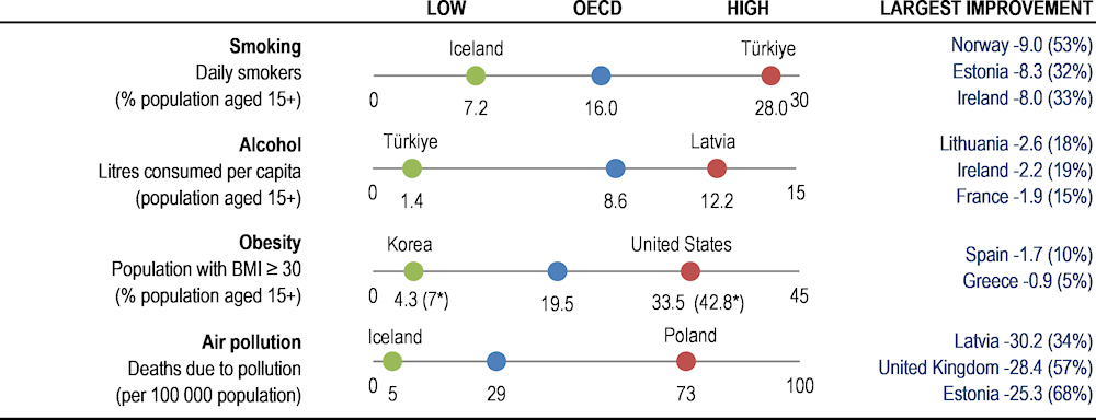
Note: Largest improvement shows countries with largest changes in absolute value over the past decade (% change in brackets). For obesity, values are self-reported except if marked with an asterisk when measured data are used. Air pollution data from 2019.
Source: OECD Health Statistics 2023; OECD Environment Statistics 2020.
Smoking causes multiple diseases, and the World Health Organization estimates that tobacco smoking kills 8 million people in the world every year. The share of people smoking daily in 2021 ranged from around 25% or more in Türkiye and France to below 10% in Iceland, Costa Rica, Norway, Mexico, Canada, the United States and Sweden. Daily smoking rates have decreased in most OECD countries over the last decade, taking the average from 20.4% in 2011 to 15.9% in 2021. In the Slovak Republic, Luxembourg and Türkiye, however, smoking rates have risen slightly.
Alcohol use is a leading cause of death and disability worldwide, particularly among people of working age. Measured through sales data, Latvia and Lithuania reported the highest levels of consumption in 2021 (above 12 litres of pure alcohol per person per year), followed by the Czech Republic, Estonia and Austria. Türkiye, Costa Rica, Israel and Colombia had comparatively low consumption levels (under 5 litres). Average consumption has fallen in 23 OECD countries since 2011. Still, harmful drinking is a concern among certain population groups, and nearly one in five adults reported heavy episodic drinking at least once a month.
Obesity is a major risk factor for many chronic conditions, including diabetes, cardiovascular diseases and cancer. On average in 2021, 19.5% of the population were obese, and 54% of the population were overweight or obese (based on self-reported data). Obesity rates were highest in Mexico, the United States and New Zealand, and lowest in Japan and Korea (based on a combination of self-reported and measured data). Caution should be used when comparing countries with reporting differences, however, since obesity rates are generally higher when using measured data.
Air pollution is not only a major environmental threat but also causes a wide range of adverse health outcomes. OECD projections estimate that ambient (outdoor) air pollution may cause 6‑9 million premature deaths a year worldwide by 2060. Premature deaths attributable to ambient particulate matter ranged from over 70 per 100 000 people in Poland and Hungary to less than 7 per 100 000 people in Iceland, New Zealand and Sweden in 2019. Mortality rates have fallen in a majority of OECD countries since 2000, but they increased in seven: Japan, Costa Rica, Korea, Chile, Mexico, Colombia and Türkiye.
Table 1.3. Dashboard on risk factors for health, 2021 (unless indicated)
|
Smoking |
Alcohol |
Obesity |
Air pollution (2019) |
|||||
|---|---|---|---|---|---|---|---|---|
|
Daily smokers (% population aged 15+) |
Litres consumed per capita (population aged 15+) |
Population with BMI≥30 (% population aged 15+) |
Deaths due to pollution (per 100 000 population) |
|||||
|
OECD |
16.0 |
+ |
8.6 |
+ |
19.5 |
- |
28.9 |
+ |
|
Australia |
11.2² |
+ |
9.5³ |
N/A |
19.5 (30.4*)³ |
N/A |
7.1 |
+ |
|
Austria |
20.6² |
+ |
11.1 |
+ |
16.6² |
- |
26.7 |
+ |
|
Belgium |
15.4² |
+ |
9.2² |
+ |
15.9 (21.2*)² |
- |
30.3 |
+ |
|
Canada |
8.7 |
+ |
8.3 |
- |
21.6 (24.3*) |
- |
10.1 |
+ |
|
Chile |
17.6¹ |
N/A |
7.1² |
= |
26.4 |
- |
30.8 |
- |
|
Colombia |
N/A |
N/A |
4.1² |
+ |
N/A |
N/A |
26.0 |
- |
|
Costa Rica |
7.8 |
+ |
3.1 |
+ |
31.2* ² |
- |
18.6 |
- |
|
Czech Republic |
17.6 |
+ |
11.6 |
- |
19.3² |
- |
58.5 |
+ |
|
Denmark |
13.9 |
+ |
10.4 |
+ |
18.5 |
- |
22.5 |
+ |
|
Estonia |
17.9¹ |
+ |
11.1 |
+ |
21¹ |
- |
12.0 |
+ |
|
Finland |
12.0¹ |
+ |
8.1 |
+ |
23 (26.8*)¹ |
- |
7.0 |
+ |
|
France |
25.3 |
+ |
10.5 |
+ |
14.4 (15.6*)² |
- |
20.3 |
+ |
|
Germany |
14.6 |
+ |
10.6² |
+ |
16.7 |
- |
32.4 |
+ |
|
Greece |
24.9² |
+ |
6.3² |
+ |
16.4² |
+ |
54.6 |
+ |
|
Hungary |
24.9² |
+ |
10.4 |
+ |
23.9 (33.2*)² |
- |
71.7 |
+ |
|
Iceland |
7.2 |
+ |
7.4¹ |
- |
21.4² |
- |
4.6 |
+ |
|
Ireland |
16.0 |
+ |
9.5 |
+ |
21 (23*)¹ |
- |
11.0 |
+ |
|
Israel |
16.4² |
+ |
3.1² |
- |
17¹ |
- |
26.8 |
+ |
|
Italy |
19.1 |
+ |
7.7² |
- |
12 |
- |
40.8 |
+ |
|
Japan |
16.7² |
+ |
6.6 |
+ |
4.6* ² |
- |
31.3 |
- |
|
Korea |
15.4 |
+ |
7.7 |
+ |
4.3 (7*)² |
- |
42.7 |
- |
|
Latvia |
22.6² |
+ |
12.2 |
- |
23.9* ¹ |
- |
58.6 |
+ |
|
Lithuania |
18.9² |
N/A |
12.1 |
+ |
18.3² |
- |
45.7 |
+ |
|
Luxembourg |
19.2 |
- |
11² |
+ |
16.5² |
- |
14.8 |
+ |
|
Mexico |
8.6 |
+ |
5.1 |
- |
36* ¹ |
- |
28.7 |
- |
|
Netherlands |
14.7 |
+ |
8.1 |
+ |
13.9 |
- |
26.7 |
+ |
|
New Zealand |
9.4 |
+ |
8.8 |
+ |
34.3* |
- |
6.3 |
+ |
|
Norway |
8.0 |
+ |
7.4 |
- |
16¹ |
- |
7.3 |
+ |
|
Poland |
17.1² |
+ |
11 |
- |
18.5² |
- |
73.3 |
+ |
|
Portugal |
14.2² |
+ |
10.4² |
+ |
16.9² |
- |
20.4 |
+ |
|
Slovak Republic |
21² |
- |
9.6 |
+ |
19.4² |
- |
63.6 |
+ |
|
Slovenia |
17.4² |
+ |
10.6 |
= |
19.4² |
- |
39.6 |
+ |
|
Spain |
19.8¹ |
+ |
10.5 |
- |
14.9¹ |
+ |
19.0 |
+ |
|
Sweden |
9.7 |
+ |
7.6 |
- |
15.3 |
- |
6.5 |
+ |
|
Switzerland |
19.1³ |
+ |
8.5 |
+ |
11.3³ |
- |
16.0 |
+ |
|
Türkiye |
28² |
- |
1.4 |
+ |
21.1 (28.8*)² |
- |
49.9 |
- |
|
United Kingdom |
12.7 |
+ |
10 |
- |
25.9 (28*) |
- |
21.4 |
+ |
|
United States |
8.8 |
+ |
9.5 |
- |
33.5 (42.8*) |
- |
14.5 |
+ |
 Better than the OECD average.
 Close to the OECD average.
 Worse than the OECD average.
1. 2020/22 data.
2. 2019 data.
3. 2017/18 data.
Notes: The symbol + indicates an improvement over time, – a deterioration, and = no change. For obesity, values are self-reported except if marked with an asterisk when measured data are used. Measured data are typically higher and more accurate than self-reported data, but with less country coverage.
Access to care
Ensuring equitable access is critical for high-performing health systems and more inclusive societies. Population coverage – measured by the share of the population eligible for a core set of services and those satisfied with the availability of quality healthcare – offers an initial assessment of access to care. The proportion of spending covered by prepayment schemes gives further insight into financial protection. The share of populations reporting unmet needs for medical care offers a measure of effective service coverage. Figure 1.4 presents a snapshot of access to care across OECD countries, and Table 1.4 provides more detailed country comparisons.
Figure 1.4. Access to care across the OECD, 2021 (or nearest year)
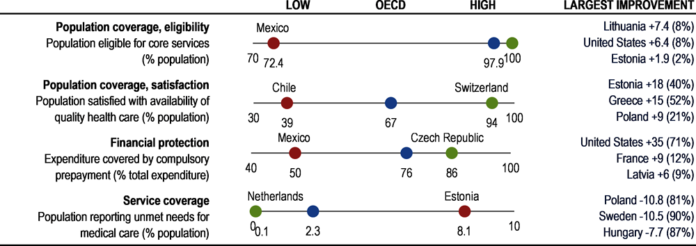
Notes: Largest improvement shows countries with largest change in absolute value over ten years (% change in brackets). Eligibility for population coverage is 100% in 22 countries. Population satisfaction data from 2022.
Source: OECD Health Statistics 2023, Gallup World Poll 2023, Eurostat based on EU-SILC.
In terms of the share of the population eligible for coverage, most OECD countries have achieved universal (or near-universal) coverage for a core set of services. However, in Mexico, population coverage was 72% in 2021, and coverage was below 95% in a further five countries (Costa Rica, the United States, Poland, Chile and Colombia).
Satisfaction with the availability of quality health services offers further insight into effective coverage. On average across OECD countries, 67% of people were satisfied with the availability of quality health services where they live in 2020. Citizens in Switzerland and Belgium were most likely to be satisfied (90% or more), whereas fewer than 50% of citizens were satisfied in Chile, Colombia, Hungary and Greece. On average, satisfaction levels have decreased slightly over time.
The degree of cost sharing applied to those services also affects access to care. Across OECD countries, around 75% of all healthcare costs were covered by government or compulsory health insurance schemes in 2021. However, in Mexico only about 50% of all health spending was covered by publicly mandated schemes, and in Greece, Korea, Chile and Portugal only around 60% of all costs were covered.
In terms of service coverage, on average across 25 OECD countries with comparable data, only 2.3% of the population reported that they had unmet care needs due to cost, distance or waiting times in 2021. However, over 5% of the population reported unmet needs in Estonia and Greece. Socio‑economic disparities are significant in most countries, with the income gradient largest in Greece, Latvia and Türkiye.
Table 1.4. Dashboard on access to care, 2021 (unless indicated)
|
Population coverage, eligibility |
Population coverage, satisfaction (2022) |
Financial protection |
Service coverage |
|||||
|---|---|---|---|---|---|---|---|---|
|
Population eligible for core services (% population) |
Population satisfied with availability of quality health care (% population) |
Expenditure covered by compulsory prepayment (% total expenditure) |
Population reporting unmet needs for medical care (% population) |
|||||
|
OECD |
97.9 |
- |
66.8 |
- |
75.9 |
+ |
2.3 |
+ |
|
Australia |
100 |
= |
71 |
- |
71.9¹ |
+ |
N/A |
N/A |
|
Austria |
99.9 |
= |
84 |
- |
78.3 |
+ |
0.2 |
+ |
|
Belgium |
98.6 |
- |
90 |
+ |
77.6 |
+ |
1.7 |
+ |
|
Canada |
100 |
= |
56 |
- |
72.9 |
+ |
N/A |
N/A |
|
Chile |
94.3 |
+ |
39 |
+ |
62.7 |
+ |
N/A |
N/A |
|
Colombia |
94.7² |
- |
41 |
- |
78.4 |
+ |
N/A |
N/A |
|
Costa Rica |
90.9 |
- |
70 |
+ |
74.5 |
+ |
N/A |
N/A |
|
Czech Republic |
100 |
= |
77 |
+ |
86.4 |
+ |
0.3 |
+ |
|
Denmark |
100 |
= |
81 |
= |
85.2 |
+ |
1.2 |
+ |
|
Estonia |
95.9 |
+ |
63 |
+ |
76.2 |
+ |
8.1 |
+ |
|
Finland |
100 |
= |
70 |
+ |
79.8 |
+ |
4.3 |
+ |
|
France |
99.9 |
= |
71 |
- |
84.8 |
+ |
2.8 |
+ |
|
Germany |
99.9 |
+ |
85 |
- |
85.5 |
+ |
0.1 |
+ |
|
Greece |
100.0 |
= |
44 |
+ |
62.1 |
- |
6.4 |
+ |
|
Hungary |
95.0 |
- |
44 |
- |
72.5 |
+ |
1.2 |
+ |
|
Iceland |
100 |
= |
68 |
- |
83.7 |
+ |
3.4² |
+ |
|
Ireland |
100 |
= |
67 |
+ |
77.4 |
+ |
2.0 |
+ |
|
Israel |
100 |
= |
69 |
= |
68.2¹ |
+ |
N/A |
N/A |
|
Italy |
100 |
= |
55 |
= |
75.5 |
- |
1.8 |
+ |
|
Japan |
100¹ |
= |
76 |
+ |
84.9¹ |
+ |
N/A |
N/A |
|
Korea |
100 |
= |
78 |
+ |
62.3 |
+ |
N/A |
N/A |
|
Latvia |
100 |
= |
57 |
+ |
69.5 |
+ |
4.0 |
N/A |
|
Lithuania |
98.8 |
+ |
51 |
= |
68.6 |
- |
2.4 |
N/A |
|
Luxembourg |
100 |
= |
86 |
- |
86.0 |
+ |
1.1 |
+ |
|
Mexico |
72.4¹ |
- |
57 |
- |
50.2 |
- |
N/A |
N/A |
|
Netherlands |
99.9 |
+ |
83 |
- |
84.9 |
+ |
0.1 |
+ |
|
New Zealand |
100 |
= |
64 |
- |
80.3 |
- |
N/A |
N/A |
|
Norway |
100 |
= |
80 |
- |
85.6 |
+ |
0.9 |
+ |
|
Poland |
94.0 |
- |
51 |
+ |
72.5 |
+ |
2.6 |
+ |
|
Portugal |
100 |
= |
63 |
+ |
63.2 |
- |
2.3 |
- |
|
Slovak Republic |
95 |
- |
54 |
- |
79.7 |
+ |
2.9 |
+ |
|
Slovenia |
100 |
= |
68 |
- |
73.7 |
+ |
4.7 |
- |
|
Spain |
100¹ |
+ |
64 |
- |
71.6 |
- |
1.1 |
+ |
|
Sweden |
100 |
= |
74 |
- |
85.9 |
+ |
1.2 |
+ |
|
Switzerland |
100 |
= |
94 |
= |
67.7 |
+ |
0.5 |
+ |
|
Türkiye |
98.8 |
+ |
53 |
- |
78.8 |
- |
2.4 |
N/A |
|
United Kingdom |
100 |
= |
67 |
- |
83.0 |
+ |
N/A |
N/A |
|
United States |
91.3 |
+ |
75 |
+ |
83.6 |
+ |
N/A |
N/A |
 Better than the OECD average.
 Close to the OECD average.
 Worse than the OECD average.
1. 2020 data.
2. 2018 data.
Notes: The symbol + indicates an improvement over time, – a deterioration, and = no change. Mexico is excluded from standard deviation calculation for population coverage.
Quality of care
High-quality care requires health services to be safe, appropriate, clinically effective and responsive to patient needs. Antibiotic prescriptions and avoidable hospital admissions are examples of indicators that measure the safety and appropriateness of primary care. Breast cancer screening is an indicator of the quality of preventive care; 30‑day mortality following acute myocardial infarction (AMI) and stroke measures the clinical effectiveness of secondary care. Figure 1.5 presents a snapshot of quality and outcome of care across OECD countries, and Table 1.5 provides more detailed country comparisons.
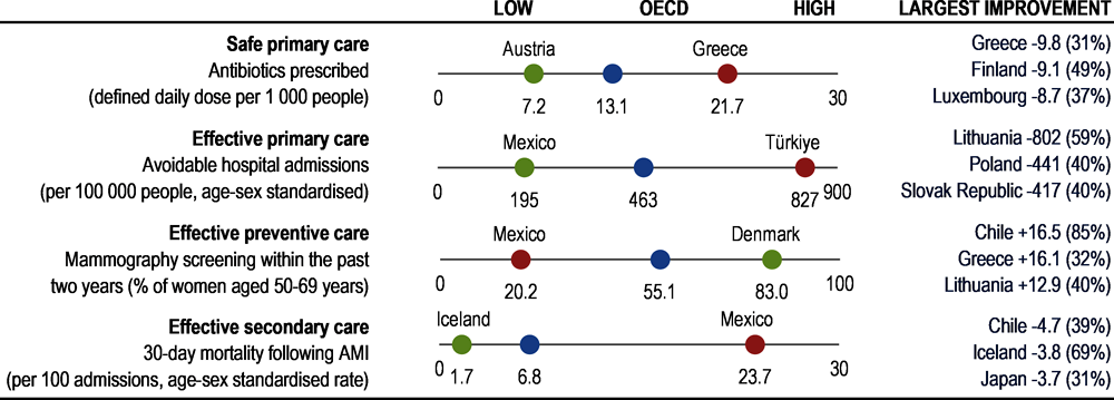
Figure 1.5. Quality of care across the OECD, 2021 (or nearest year)
Note: Largest improvement shows countries with largest changes in absolute value over ten years (% change in brackets).
Source: OECD Health Statistics 2023; ECDC 2023 (for EU/EEA countries on antibiotics prescribed).
The overuse, underuse or misuse of antibiotics and other prescription medicines contribute to increased antimicrobial resistance and represent wasteful spending. The total volumes of antibiotics prescribed in 2021 varied three‑fold across countries: Austria, the Netherlands and Germany reported the lowest volumes, whereas Greece, France, Poland and Spain reported the highest volumes. Across OECD countries, the volume of antibiotics prescribed has decreased slightly over time.
Asthma, chronic obstructive pulmonary disease, congestive heart failure and diabetes are all chronic conditions that can largely be treated in primary care – hospital admissions for such conditions may signal quality issues in primary care, with the proviso that very low admission rates may also partly reflect limited access. Aggregated together, such avoidable hospital admissions were highest in Türkiye, Germany and the United States in 2021, among 32 countries with comparable data. In almost all countries, these avoidable hospital admissions have been declining over the past decade.
Breast cancer is the cancer with the highest incidence among women in all OECD countries, and the second most common cause of cancer death among women. Timely mammography screening is critical to identify cases, allowing treatment to start at an early stage of the disease. In 2021, mammography screening rates were highest in Denmark, Finland, Portugal and Sweden (80% or higher among women aged 50‑69). Screening rates were lowest in Mexico, Türkiye, the Slovak Republic and Hungary (all under 30%). Despite favourable long-term trends for many countries, COVID‑19 had a large impact on screening programmes, and the average screening rate was 5 percentage points lower in 2021 than in 2019.
Mortality following AMI and stroke are long-established indicators of the quality of acute care. Both have been declining steadily in the last decade in most countries, yet important cross-country differences still exist. Taking the two indicators together, Mexico and Latvia had by far the highest 30‑day mortality rates in 2021, and rates were also relatively high in Estonia and Lithuania. Iceland, Norway, the Netherlands and Australia had the lowest rates (comparisons based on unlinked data, as defined in Chapter 6).
Table 1.5. Dashboard on quality of care, 2021 (unless indicated)
|
Safe primary care |
Effective primary care |
Effective preventive care |
Effective secondary care |
||||||
|---|---|---|---|---|---|---|---|---|---|
|
Antibiotics prescribed (defined daily dose per 1 000 people) |
Avoidable hospital admissions (per 100 000 people, age-sex standardised) |
Mammography screening within the past 2 years (% women aged 50-69) |
AMI |
Stroke |
|||||
|
30-day mortality following AMI or stroke (per 100 admissions aged 45 years and over, age-sex standardised) |
|||||||||
|
OECD |
13.1 |
+ |
463 |
+ |
55.1 |
- |
6.8 |
7.8 |
+ |
|
Australia |
16.8 |
- |
654 |
+ |
47.1 |
- |
3.3¹ |
4.8 |
+ |
|
Austria |
7.2 |
+ |
483 |
+ |
40.1 |
N/A |
5.8 |
6.6 |
+ |
|
Belgium |
16.0 |
+ |
633² |
- |
56.1¹ |
- |
4.3 |
8.2 |
+ |
|
Canada |
9.0 |
N/A |
388 |
+ |
59.7² |
+ |
4.7 |
7.7 |
+ |
|
Chile |
N/A |
N/A |
220 |
+ |
35.8 |
+ |
7.2² |
8.3 |
+ |
|
Colombia |
N/A |
N/A |
N/A |
N/A |
N/A |
N/A |
5.6² |
6.1 |
+ |
|
Costa Rica |
N/A |
N/A |
278³ |
+ |
36 |
+ |
N/A |
N/A |
N/A |
|
Czech Republic |
11.5 |
N/A |
577 |
+ |
58.3 |
+ |
6.2 |
9.4 |
= |
|
Denmark |
12.6 |
+ |
538 |
+ |
83.0 |
= |
4.8 |
4.9 |
+ |
|
Estonia |
8.7 |
+ |
354 |
+ |
58.7 |
+ |
11.3 |
9.0 |
- |
|
Finland |
9.4 |
+ |
490 |
+ |
82.2 |
- |
7.3 |
9.1 |
+ |
|
France |
19.3 |
+ |
601⁴ |
+ |
46.9 |
- |
5.5² |
7.3⁴ |
+ |
|
Germany |
8.1 |
+ |
728 |
+ |
47.5 |
- |
8.6 |
6.6 |
+ |
|
Greece |
21.7 |
+ |
N/A |
N/A |
65.7² |
+ |
N/A |
N/A |
N/A |
|
Hungary |
10.8 |
+ |
N/A |
N/A |
29.8 |
- |
N/A |
N/A |
N/A |
|
Iceland |
15.7 |
+ |
308 |
+ |
54.0 |
- |
1.7 |
3.1 |
+ |
|
Ireland |
16.3 |
+ |
498 |
+ |
62.4 |
- |
5.4 |
6.3 |
+ |
|
Israel |
14.4 |
+ |
440 |
+ |
71.9 |
+ |
5.2 |
5.4 |
+ |
|
Italy |
15.9 |
+ |
214 |
+ |
55.9 |
- |
5.3² |
6.6⁴ |
+ |
|
Japan |
12.2² |
+ |
N/A |
N/A |
44.6² |
+ |
8.3¹ |
2.9 |
+ |
|
Korea |
16.0 |
+ |
375 |
+ |
69.9 |
+ |
8.4 |
3.3 |
+ |
|
Latvia |
10.1 |
+ |
N/A |
N/A |
30.8 |
- |
15.9 |
20.5 |
- |
|
Lithuania |
11.7 |
N/A |
554 |
+ |
45.5 |
+ |
10.3 |
15.4 |
+ |
|
Luxembourg |
14.6 |
+ |
502 |
- |
53.8 |
- |
9.9 |
6.0 |
+ |
|
Mexico |
N/A |
N/A |
195 |
+ |
20.2¹ |
+ |
23.7 |
17.2 |
+ |
|
Netherlands |
7.6 |
+ |
318 |
+ |
72.7 |
- |
2.9 |
4.9 |
+ |
|
New Zealand |
N/A |
N/A |
N/A |
N/A |
63.3 |
- |
4.1 |
5.9 |
+ |
|
Norway |
12.8 |
+ |
477 |
+ |
65.5 |
- |
2.6 |
3.1 |
+ |
|
Poland |
18.8 |
- |
663 |
+ |
33.2 |
N/A |
5.2 |
11.8³ |
+ |
|
Portugal |
13.7 |
+ |
266 |
N/A |
80.2² |
- |
8.0 |
10.4 |
+ |
|
Slovak Republic |
14.5 |
+ |
615 |
+ |
25.5 |
- |
7.4 |
9.9 |
+ |
|
Slovenia |
8.7 |
+ |
367 |
+ |
77.2 |
+ |
5.1 |
12.1 |
+ |
|
Spain |
18.4 |
- |
356 |
+ |
73.8¹ |
- |
6.5 |
9.4 |
+ |
|
Sweden |
8.6 |
+ |
361 |
+ |
80.0 |
N/A |
3.6 |
5.5 |
+ |
|
Switzerland |
N/A |
N/A |
424 |
- |
49³ |
+ |
5.1⁴ |
5.6⁴ |
+ |
|
Türkiye |
11.3 |
+ |
827³ |
N/A |
20.5 |
- |
6.0 |
7.6 |
N/A |
|
United Kingdom |
N/A |
N/A |
403 |
+ |
64.2 |
- |
6.7 |
9.0 |
+ |
|
United States |
N/A |
N/A |
725 |
+ |
76.1 |
- |
5.5¹ |
4.3 |
- |
 Better than the OECD average.
 Close to the OECD average.
 Worse than the OECD average.
1. 2020 data.
2. 2019 data.
3. 2017/18 data.
4. 2014/15 data.
Notes: The symbol + indicates an improvement over time, – a deterioration, and = no change. Latvia and Mexico are excluded from the standard deviation calculation for AMI and stroke mortality. OECD averages shown here differ slightly from those in chapter 6 due to differences in country coverage. Avoidable hospital admissions cover asthma, chronic obstructive pulmonary disease, congestive heart failure and diabetes.
Health system capacity and resources
Having sufficient healthcare resources is critical to a resilient health system. More resources, though, do not automatically translate into better health outcomes – the effectiveness of spending is also important. Health spending per capita summarises overall resource availability. The number of practising doctors and nurses provide further information on the supply of health workers. The number of hospital beds is an indicator of acute care capacity. Figure 1.6 presents a snapshot of health system capacity and resources across OECD countries, and Table 1.6 provides more detailed country comparisons.
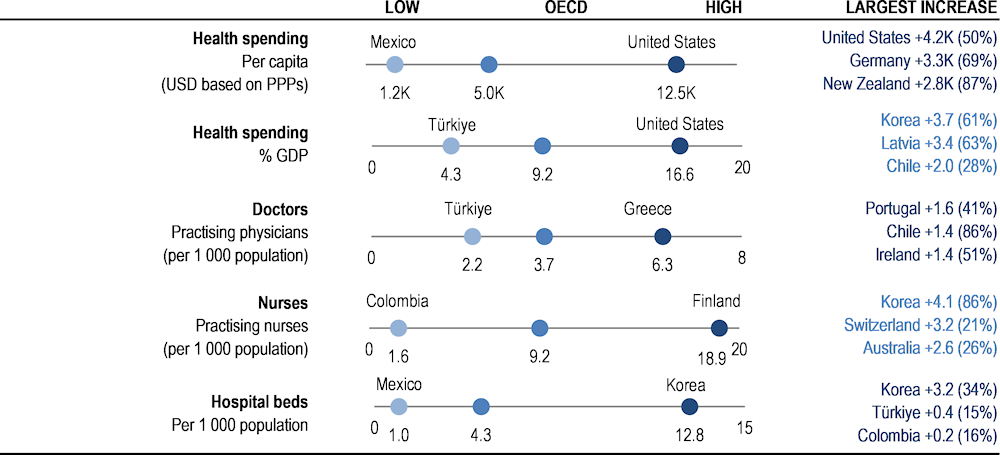
Figure 1.6. Health system capacity and resources across the OECD, 2021 (or nearest year)
Note: Largest increase shows countries with largest changes in absolute value over ten years (% change in brackets). Health spending data from 2022.
Source: OECD Health Statistics 2023.
Overall, countries with higher health spending and higher numbers of health workers and other resources have better health outcomes, access and quality of care. However, the absolute quantity of resources invested is not a perfect predictor of better outcomes – risk factors for health and the wider social determinants of health are also critical, as is the efficient use of healthcare resources.
The United States spent considerably more than any other country (USD 12 555 per person, adjusted for purchasing power) in 2021, and also spent the most when measured as a share of gross domestic product (GDP). Health spending per capita was also relatively high in Switzerland, Germany, Norway, the Netherlands and Austria. Mexico, Colombia, Costa Rica and Türkiye spent the least, at less than USD 2 000 per capita. While health spending has typically grown faster than GDP over the past decade, its share in the overall economy has fallen in most countries since the height of the pandemic, reflecting the challenging current economic climate.
A large part of health spending is translated into wages for the workforce. The number of doctors and nurses is therefore an important indicator to monitor how resources are being used. In 2021, the number of doctors ranged from less than 2.5 per 1 000 population in Türkiye to over 5 per 1 000 in Norway, Austria, Portugal and Greece. However, numbers in Portugal and Greece are overestimated as they include all doctors licensed to practise. On average, there were just over 9 nurses per 1 000 population in OECD countries in 2021, ranging from less than 3 per 1 000 in Colombia, Türkiye and Mexico to over 18 per 1 000 in Finland, Switzerland and Norway. In Switzerland, associate professional nurses explain this high density.
The number of hospital beds provides an indication of resources available for delivering inpatient services. COVID‑19 highlighted the need to have sufficient hospital beds (particularly intensive care beds), together with enough doctors and nurses. Still, a surplus of beds may cause unnecessary use and therefore costs – notably for patients whose outcomes may not improve from intensive care. Across OECD countries, there were on average 4.3 hospital beds per 1 000 people in 2021. Over half of OECD countries reported between 3 and 8 hospital beds per 1 000 people. Korea and Japan, however, had far more hospital beds (12‑13 per 1 000 people), while Mexico, Costa Rica and Colombia had relatively few.
Table 1.6. Dashboard on health system capacity and resources, 2021 (unless indicated)
|
Health Spending (2022) |
Doctors |
Nurses |
Hospital beds |
|||||||
|---|---|---|---|---|---|---|---|---|---|---|
|
Per capita (USD based on purchasing power parities) |
% GDP |
Practising physicians (per 1 000 population) |
Practising nurses (per 1 000 population) |
Per 1 000 population |
||||||
|
OECD |
4 986 |
+ |
9.2 |
+ |
3.7 |
+ |
9.2 |
+ |
4.3 |
- |
|
Australia |
6 372 |
+ |
9.6 |
+ |
4.0 |
+ |
12.8 |
+ |
3.8³ |
+ |
|
Austria |
7 275 |
+ |
11.4 |
+ |
5.4 |
+ |
10.6 |
N/A |
6.9 |
- |
|
Belgium |
6 600 |
+ |
10.9 |
+ |
3.3 |
+ |
11.1² |
+ |
5.5 |
- |
|
Canada |
6 319 |
+ |
11.2 |
+ |
2.8 |
+ |
10.3 |
+ |
2.6 |
- |
|
Chile |
2 699 |
+ |
9.0 |
+ |
2.9 |
+ |
3.7 |
+ |
2.0 |
- |
|
Colombia |
1 640 |
+ |
8.1 |
+ |
2.5 |
+ |
1.6 |
+ |
1.7¹ |
+ |
|
Costa Rica |
1 658 |
+ |
7.2 |
- |
N/A |
N/A |
N/A |
N/A |
1.2 |
- |
|
Czech Republic |
4 512 |
+ |
9.1 |
+ |
4.3 |
+ |
9.0 |
+ |
6.7 |
- |
|
Denmark |
6 280 |
+ |
9.5 |
- |
4.4¹ |
+ |
10.2¹ |
+ |
2.5 |
- |
|
Estonia |
3 103 |
+ |
6.9 |
+ |
3.4 |
+ |
6.5 |
+ |
4.4 |
- |
|
Finland |
5 599 |
+ |
10.0 |
+ |
3.6¹ |
+ |
18.9¹ |
+ |
2.8 |
- |
|
France |
6 630 |
+ |
12.1 |
+ |
3.2 |
+ |
9.7 |
+ |
5.7 |
- |
|
Germany |
8 011 |
+ |
12.7 |
+ |
4.5 |
+ |
12.0 |
+ |
7.8 |
- |
|
Greece |
3 015 |
+ |
8.6 |
- |
6.3 |
+ |
3.8 |
+ |
4.3 |
- |
|
Hungary |
2 840 |
+ |
6.7 |
- |
3.3 |
+ |
5.3 |
N/A |
6.8 |
- |
|
Iceland |
5 314 |
+ |
8.6 |
+ |
4.4 |
+ |
15.0 |
+ |
2.8¹ |
- |
|
Ireland |
6 047 |
+ |
6.1 |
- |
4.0 |
+ |
12.7 |
N/A |
2.9 |
N/A |
|
Israel |
3 444 |
+ |
7.4 |
+ |
3.4 |
+ |
5.4 |
+ |
2.9 |
- |
|
Italy |
4 291 |
+ |
9.0 |
+ |
4.1 |
+ |
6.2 |
+ |
3.1 |
- |
|
Japan |
5 251 |
+ |
11.5 |
+ |
2.6¹ |
+ |
12.1¹ |
+ |
12.6 |
- |
|
Korea |
4 570 |
+ |
9.7 |
+ |
2.6 |
+ |
8.8 |
+ |
12.8 |
+ |
|
Latvia |
3 445 |
+ |
8.8 |
+ |
3.4 |
+ |
4.2 |
- |
5.2 |
- |
|
Lithuania |
3 587 |
+ |
7.5 |
+ |
4.5 |
+ |
7.9 |
+ |
6.1 |
- |
|
Luxembourg |
6 436 |
+ |
5.5 |
+ |
3.0³ |
+ |
11.7³ |
+ |
4.1 |
- |
|
Mexico |
1 181 |
+ |
5.5 |
- |
2.5 |
+ |
2.9 |
+ |
1.0 |
- |
|
Netherlands |
6 729 |
+ |
10.2 |
- |
3.9 |
+ |
11.4 |
+ |
3.0 |
- |
|
New Zealand |
6 061 |
+ |
11.2 |
+ |
3.5 |
+ |
10.9 |
+ |
2.7 |
- |
|
Norway |
7 771 |
+ |
7.9 |
- |
5.2 |
+ |
18.3 |
+ |
3.4 |
- |
|
Poland |
2 973 |
+ |
6.7 |
+ |
3.4 |
N/A |
5.7 |
+ |
6.3 |
- |
|
Portugal |
4 162 |
+ |
10.6 |
+ |
6 |
+ |
7.4 |
+ |
3.5 |
+ |
|
Slovak Republic |
2 756 |
+ |
7.8 |
+ |
3.7 |
+ |
5.7 |
- |
5.7 |
- |
|
Slovenia |
4 114 |
+ |
8.8 |
+ |
3.3 |
+ |
10.5 |
+ |
4.3 |
- |
|
Spain |
4 432 |
+ |
10.4 |
+ |
4.5 |
+ |
6.3 |
+ |
3.0 |
- |
|
Sweden |
6 438 |
+ |
10.7 |
- |
4.3¹ |
+ |
10.7¹ |
- |
2.0 |
- |
|
Switzerland |
8 049 |
+ |
11.3 |
+ |
4.4 |
+ |
18.4 |
+ |
4.4 |
- |
|
Türkiye |
1 827 |
+ |
4.3 |
- |
2.2 |
+ |
2.8 |
+ |
3.0 |
+ |
|
United Kingdom |
5 493 |
+ |
11.3 |
+ |
3.2 |
+ |
8.7 |
+ |
2.4 |
- |
|
United States |
12 555 |
+ |
16.6 |
+ |
2.7 |
+ |
12.0 |
+ |
2.8 |
- |
 Above the OECD average.
 Close to the OECD average.
 Below the OECD average.
1. 2020 data.
2. 2018 data.
3. 2016/17 data.
Notes: The symbol + indicates an increase over time, – a reduction, and = no change. Japan and Korea are excluded from standard deviation calculation for hospital beds. The United States is excluded from standard deviation calculation for spending per capita and as a share of GDP.
To what extent does health spending translate into better health outcomes, access and quality of care?
Quadrant charts plot the association between health spending and selected indicators of health system goals. They illustrate the extent to which spending more on health translates into stronger performance across three dimensions: health outcomes, access and quality of care. Note, though, that only a small subset of indicators for these three dimensions are compared against health spending, with quadrant charts showing simple statistical correlations rather than causal links.
Health spending and health outcomes
Figure 1.7 and Figure 1.8 illustrate the extent to which countries that spend more on health have better health outcomes (note that such associations do not guarantee a causal relationship).
Figure 1.7. Life expectancy and health expenditure
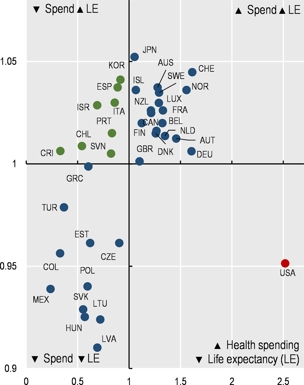
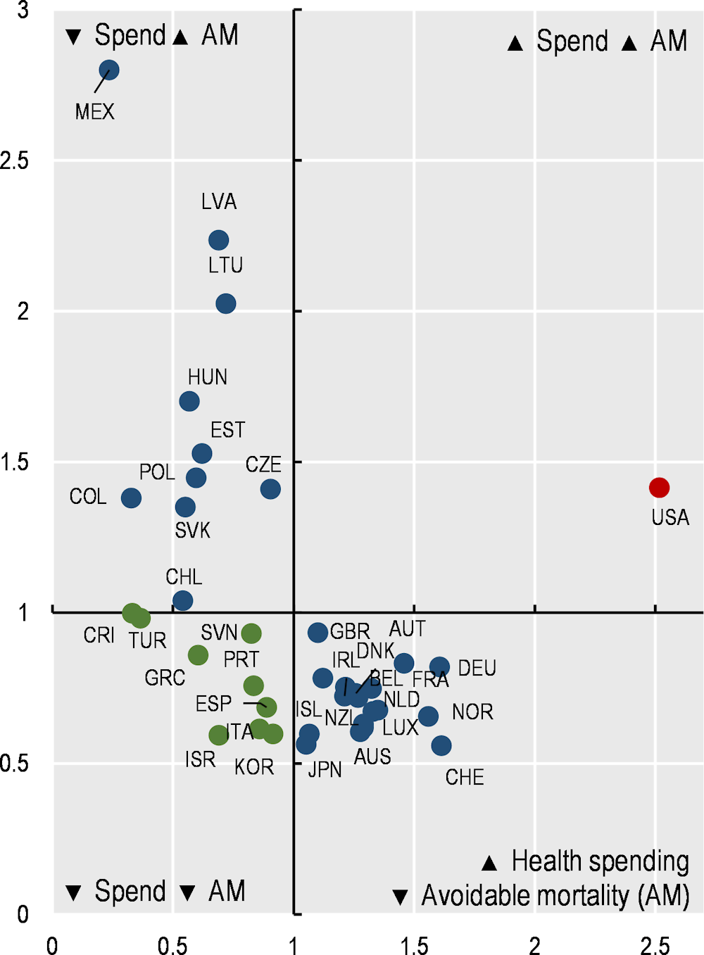
Figure 1.8. Avoidable mortality (preventable and treatable) and health expenditure
There is a clear positive association between health spending per capita and life expectancy at birth (Figure 1.7). Among the 38 OECD countries, 18 spend more and have higher life expectancy than the OECD average (top right quadrant). A further 11 countries spend less and have lower life expectancy than the OECD average (bottom left quadrant).
Of particular interest are countries that deviate from this basic relationship. Eight countries spend less than the OECD average but achieve higher life expectancy overall (top left quadrant). This may indicate relatively good value for money of health systems, notwithstanding the fact that many other factors also have an impact on health outcomes. These eight countries are Korea, Spain, Italy, Israel, Portugal, Chile, Costa Rica and Slovenia. The only country in the bottom right quadrant is the United States, with much higher spending than all other OECD countries but lower life expectancy than the OECD average.
For avoidable mortality, there is also a clear association in the expected direction (Figure 1.8). Among OECD countries, 18 spend more and have lower avoidable mortality rates (bottom right quadrant), and 10 spend less and have more deaths that could have been avoided (top left quadrant). Nine countries spend less than average but have lower avoidable mortality rates – Israel, Korea, Italy, Spain, Portugal, Greece, Slovenia, Türkiye and Costa Rica (bottom left quadrant). The United States spends more than the OECD average and has worse avoidable mortality rates.
Health spending, access and quality of care
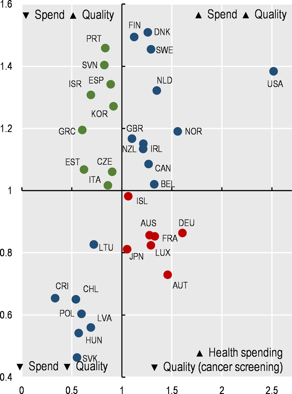
Figure 1.9 and Figure 1.10 illustrate the extent to which countries that spend more on health deliver more accessible and better-quality care (note that such associations do not guarantee a causal relationship).
Figure 1.9. Satisfaction with availability of quality services and health expenditure
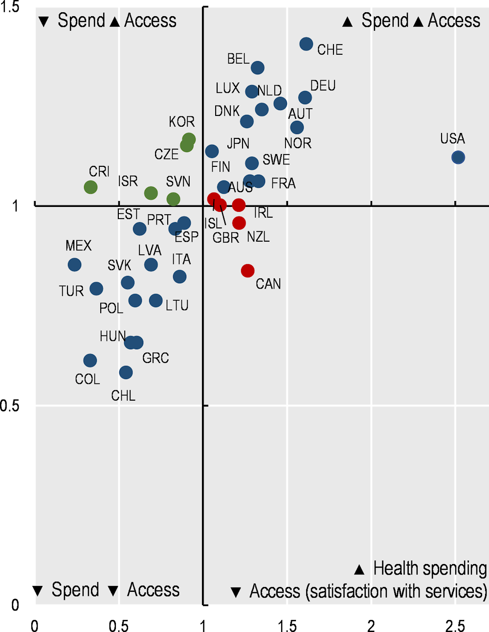
Figure 1.10. Breast cancer screening and health expenditure
In terms of access, Figure 1.9 shows a clear positive correlation between the share of the population satisfied with the availability of quality healthcare where they live and health spending per capita. Among OECD countries, 14 spent more and had a higher share of the population satisfied with availability than the OECD average (top right quadrant). The converse was true in 14 countries (bottom left quadrant). In Canada, health spending was 27% higher than the OECD average, but only 56% of the population were satisfied with the availability of quality healthcare (compared to 67% on average across OECD countries). In Korea and the Czech Republic, health spending per capita was relatively low, but a noticeably greater share of the population were satisfied with the availability of quality healthcare than the OECD average.
In terms of quality of care, Figure 1.10 shows the relationship between health spending and breast cancer screening rates. While there is an overall weak positive correlation between health spending and the share of women screened regularly, nine countries spent less than the OECD average yet had higher cancer screening rates (top left quadrant), while seven countries spent more than the OECD average and had lower cancer screening rates (bottom right quadrant).